National Broadcasting Company, Inc


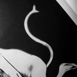
The NBC logo really changed alot over the years. First it was a microphone surrounded by lighting bolts [1943]- which was a modification of a logo used by the radio network. The lighting bolts were also used on RCA's logo - which was a parent company. Then in 1954 it was a xylophone and mallet, along with the three tone 'bing-bong-bing.' And then, 1956, the peacock logos started - first it was really stylized [which was first used to identify nbc's color broadcasts]. The peacock was used to show the richness of color - and had 11 feathers. The logo became nbc's solo logo in 1986 because people identified with it so much.
In 1979 there was a new logo - with less colors and the bird facing forward, and not to the side. The bird's feet were gone and it became a simpler triangle shape. It was accompanied by the N to create a design called "The Perfect N"
The 6 feathered logo appeared in 1986 and had 6 primary colors - representing the network's divisions, which at the time was News, Sports, Entertainment, Stations, Network, and Productions. It was first introduced during NBC's 60th anniversary special. It was designed by Chermayeff & Geismar.

swoosh

So I was doing a little research to see which logo I want to write about and I started with Nike.
From wikipedia:
"1971: A graphic design student at Portland State University named Carolyn Davidson is hired by Knight to design the new brand to put on the side of his company's shoes. She is paid $35 (US), and works for Nike for a few years until they need a full ad agency. Twelve years later, in 1983, Ms. Davidson receives a gold Swoosh ring with an embedded diamond at a luncheon honoring her, along with a certificate and an undisclosed amount of Nike stock, in recognition of the Swoosh design logo."

That's it?! 35 dollars?? I really hope they gave her an assload of stock...

dead baby factory

I always see it outside my window. It's always spewing smoke. When the sunsets, when it rains, when it's sunny, when I look over at the window at 3 in the morning. And I finally saw it close up! It's even creepier than from far away.


good news

Well, kids, look out for my Spoon poster - featured on buses near you [sometime in the future]!

[the black and white one with the black squares]

turn on the bright lights

Here are my awwwwwesome Interpol pictures. The concert was great. Standing tickets are also great. I really loved the light show, see for yourself:
CLICK for a bigger picture on some of them.


Image hosted by Photobucket.com

more poster design

We got our first actualy assigment for star course ad design. A 17x11 poster for Spoon that's gonna go on buses. I made 3 for the hell of it:

Image hosted by Photobucket.com

Image hosted by Photobucket.com

Image hosted by Photobucket.com


It's funny, because what Daniel was talking about in class is true - you can't get attached to a design. I re-designed and re-worked these and got much better designs.

poster design

Here's my poster for Star Course's ad design committee and their little contest. A lot of people signed up so they decided to have a poster contest to see who's good enough. Uhh...being a graphic design major, I really hope this is good enough.

test run one

Image hosted by Photobucket.com


Okay. Here are my problems with it:
1.) I like the earthy, but maybe a bit too earthy. I saved a pretty nice color scheme at the art building, so I gotta pull that out and maybe tweak it.
2.) the way the words curve around the circle will end up having too much work to be done because it's all weird now.
3.) the font looks ugly on 'school of.' UGH it sucks not having all of the frutiger typefaces but just the "45 Light" that I downloaded online [and I'm not sure if I still know the difference between typeface and font]
4.) Maybe I added too many viney things?
5.) Blah.

this may or may not be difficult


This is what I came up with so far for the 'background' on the shirt. I used a pdf file of the campus map and changed everything to be the color of the shirt. Then I put an orange circle on top and used some crazy filter to make it look all hatchy. But I don't know how I feel about it....Blah! I want to use Illustrator, but I don't know if well enough to be amazing at it. Because you can do some cool vector shit on Illustrator.

Poor Rock

My spoon is TOO big!

Image hosted by Photobucket.com Image hosted by Photobucket.com

I love Bitter Films/Rejected. And also, temporary anesthetics.

What's a Soof-yawn?

Positive

Image hosted by Photobucket.com


I always saw this thing on some columns on the way to ISR, it's by that "do not defecate" sign I saw earlier. I saw positive and negative space here - the dark spray painted parts versus the background. How this was originally made also used positive and negative shapes. When you make this what you cut out first is reversed in regards to what comes out when spray painted.

Image hosted by Photobucket.com
The word positive can be thought of scientiffically as well - in this case, in regards to physics. Protons are positive. And this weird/ugly drawing I did of an atom has protons in the nucleaus [which actually doesnt really look like that]. But in any case, protons are positive and many things in the physical world can have positive charges.

Image hosted by Photobucket.com
The dictionary.com defintion of positive talked about the camera and that's why I posted this picture. Film is negative and once it's put in the enlarger and light is exposed on photopaper, and puts the positive image on the paper. So what we see on photographs is the positive, whereas what the camera sees is negative. This picture is from my high school photo class, it's a self portrait.

Image hosted by Photobucket.com
Positive can also be a direction, as in the x and y positive up and right directions. I always end up choosing scientific or mathematical images. I don't know. Using imagery from that can be very conceptual and helpful.


Image hosted by Photobucket.com
When I thought of positive, I also thought of signs - for example, there are negative signs such as "no smoking." So what is their positive counterpart? So I typed in "go sign" in google image search and this is what came up. Signs can be positive and lead us towards a direction as well. That's what positiveness does - it's optimistic and good and can lead a person.

positive

it's complicated:

  1. Characterized by or displaying certainty, acceptance, or affirmation: a positive answer; positive criticism.
  2. Measured or moving forward or in a direction of increase or progress.
  3. Explicitly or openly expressed or laid down: a positive demand.
  4. Admitting of no doubt; irrefutable: positive proof.
    1. Very sure; confident: I'm positive he's right.
    2. Overconfident; dogmatic.
  5. Formally or arbitrarily determined; prescribed.
  6. Concerned with practical rather than theoretical matters.
  7. Composed of or characterized by the presence of particular qualities or attributes; real.

<3

Look at this beautiful vector art:
a.)* Love In The Afternoon
b.) I totally have the brushes that this person used, oh em gee: Carnage
c.) I love this dude: novenarik
d.) Euphoria
e.)* Spirits

a + d + e + f are sort of what I wanted to do with the t-shirt design. my concept being something to do with growing with art. i want to do lots of organic flowing vein-like shapes coming up from the lower left side of the tshirt.

I really need to learn to use illustrator better.

oh my cod!

Today in my psych class we started vision. My psych class is that recommended one for GD majors - Psych 230 - Perception and Sensory Processes.
Here's the cool shit I learned today:
  • 70% of the information from the world comes in through the eyes. So if you count up all of the sensory receptors in the human body, 70% of them are being used in and through the eyes. So therefore, vision is such an important thing.
  • The upper spectrum of light - red wavelengths - are hardest to be absorbed by rods in the retina. Rods respond better to blue [and a bit to green] and very little to red. But if we are talking about the upper spectrum of light, then yellow is the easiest to see from that.
  • People with lighter colored eyes get worse red eye when in pictures because their light eyes absorb more light in. And we can see that in our friend Andy who has amazingly blue eyes that make him look like satan in pictures.
This is my trippy picture from the crazy dance party over the weekend. I took it while the strobe light was going off. I really like how the person's hands came out on the left side.

Here's a close up even though it doesn't look that much bigger. Blogger seems to make pictures smaller and it angers me.

Go Jesus!

So this is what I saw on the quad today. I managed to get a decent picture - the guy was waving his bible around while he was yelling. I personally love the guy with the sign over his chest - just standing there in his nice formal clothes. I don't think he moved at all.

More Pictures


Mmm, nature is awesome.


On the quad, these things were everywhere. If you get it, then you are an awesome geek. "Somebody set us up the bomb!" And if you don't know this little piece of online nerd culture, then you can actually read up on it at wikipedia!

Yaay!


I need to share some pictures of my kitty. I took them over the 3 day weekend at home. I don't know. They're artsy and cute.

Kicia


My camera has a really cool function on it that does 16 shots continuously and lines it up in rows and columns in one photograph. It's really cool and I love it. So during the weekend when I went home I took lots of pictures of my cat, Kicia. I really like the idea behind those 16-continuous shots and so, I took the best pictures of Kicia and stuck them together.
But that function can create some really cool effects, especially when I'm thinking of some specific concept.

Preference 5.0

Preference is an interesting idea in this image. But, I keep getting confused on the idea of 'preference' itself. I keep going back to the defintion - but then the natural idea I have of preference in my head. But then again... dictionary. com says "The right or chance to so choose" as one of the definitions of preference. It's hard capturing a 'right or chance.'
But in this particular image - preference can be brought on many levels. One pile prefers to lean one way versus another. One 'roll' of paper prefers to stay in place versus falling off the rest. Who prefered to leave these piles upon piles of paper and data? Who would have a preference for such a weird thing - of having random piles of paper lie on a table, on the 3rd floor of the Art Annex next to vents and ducts that make lots of weird noise and sound creepy.


Preference 4.0

These veins prefer to grow up and over buildings. Am I stretching this? I hope not.
But, veins prefer to grow up against gravity and grab on to the wall.
Dictionary.com says:
  1. The selecting of someone or something over another or others.
  2. The right or chance to so choose.
  3. Someone or something so chosen
Do these veins prefer to grow the way they do, or is it scientifically engrained in them. [I really hope I'm not stretching this idea.] Is their right to prefer to grow the way they do scientifically/biologically explainable? It's not really preference, but probably just nature. Veins just naturally do this - they are able to grow because of the xylem and phloem and etc.

Preference 3.0

This preference refers more to choices and choosing. When you have lots and lots to choose from, what do you pick? Compared to the smaller picture, when you have little to choose from, what do you pick then, and why? This is in regards to little or too many choices or preferences.

Preference 2.0

This bike prefers the rail to the bike rack. Why? Who knows. Maybe the person preferred the rail to the bike rack. Maaaaaybe the bike rack was full - so the 'preference' wasn't really an option but the only choice possible.

Preference 1.0

This is the literal sense of preference, choosing something over another. In this case with a humorous twist - prefering water or a glass of beer. Pat's in the background looking confused - which is something that comes out of choosing.

assignment #1


Here is the final.


This is what I first used for the S.

asking people

What do you think of when you hear the word 'preference'?

e (9:49:58 PM): what do you prefer
e (9:51:43 PM): choices
e (9:51:51 PM): chocolate vs. vanilla
e (9:51:57 PM): white vs. black

ma (9:53:41 PM): competition
ma (9:54:03 PM): you start evaluating things

project 1

I spent like 2 hours walking around campus taking pictures of things that look like my initials, but it all usually came out architectural. And that didn't explain anything about me. But I was going to end up using some of it, because you can always manipulate things to fit you. It's funny though, I came home, uploaded all my pictures and when to Kovac's class, came back and looked around my room and things just fell into place. And the pictures I took in my dorm all relate to me, it's more personal.

Tension 5.0

This image is in regards to the phrase "the tension was so thick you could cut it with a knife." I took the picture myself and moved the knife up and down. I really like the hazy cloud that came out - because it looks 'thick' and adds to the concept of the phrase. I really like playing around with words and making puns, so this idea was fun to do.

Tension 4.0


Here I thought of tension as stress and overworking. This picture also reminds me of a 'tension headache.' The concept of tension is more literal here than my first example. Tension can be though of in two ways. Dictionary.com defines tension as "The condition of so being stretched; tautness." Therefore, overworking can lead one to overstretch their abilities. Tension was also defined as "Mental, emotional, or nervous strain" which is what happens when one is under stress for long periods of time. And jobs and working are one of the main causes of stress.
[picture is from sxc.hu]

Tension 3.0

I asked several people what they thought of when hearing 'tension.' The engineers of the bunch replied with answers regarding physics and ropes being pulled. Tension is a force, or a measure of a force that tends to stretch or elongate something [dictionary.com]. And so, this is a simple picture of tension on two pieces of rope [T] hold up an object. The Ty and Tx are the vertical and horizontal components of T, and using those you can find the tension of the ropes. Which according to spark notes [which is where I found this] equals 34.6N. Therefore, tension can also be thought of in a scientific way.

Tension 2.0

This is also in Loomis on my way to class. My reasoning for tension here is that one poster overcomes the other and not only creates tension between the posters, but also tension for the viewer. The posters themselves are in a sort of 'fight' for viewer attention. The viewer feels tension because they can't see what's underneath the other poster. While walking I actually stopped and looked underneath the top poster because I was curious to what it was and it annoyed me that what was there was covered up.