quenchless autumn breezes

Bad news: my camera is malfunctioning. The lens makes weird noises when it closes and doesn't want to focus sometimes. At certain distances it focuses correctly. The majority of the time blur isn't that bad, other times it's ridiculous. And my camera is only 4 months old. This hurts, people.
Anyone who knows anything about digital camera or Nikons heellpp meee.

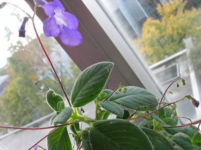
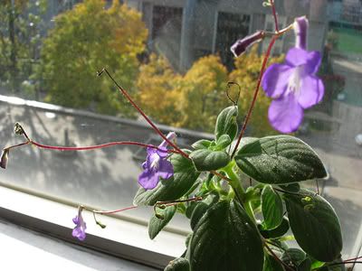
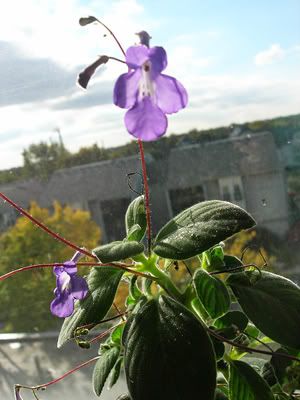
Here's some pictures.


nothing is as blinding as your eyes

I'm back on my old Metric streak. I've been listening way too much to the songs "The People" and "Hardwire." Mmm, pretty metric lyrics.

I bought a plant a while ago on the quad for $1. It started to bloom earlier this week.


weeeee

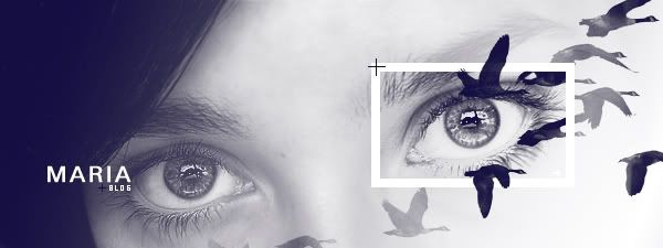
I've been screwing around in Photoshop for a while with this picture and I made it in hopes of being a banner for this blog. But then the way the html for these blog templates is made is way too screwy and weird. And I don't understand it. So I'll just post the header and maybe I'll get around to figuring out to how change the html on the template.
But anyways, I've been tweaking this for far too long, so I'm just gonna let it go and be done with it. Here it is:


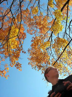
[it's my eyes, aww gee whiz, aren't they purdy]

the things you find in the street

I saw a pig's head in a parking space a couple days ago, on Chalmers. I really wanted to take a picture of it, but I had to go to class. And when I was coming back home, it was too dark and cold and I was too hungry to stop and forage for my camera.
But this was a huge head. Just image a pig, and then decapitate it in your mind, and place that pig's head flat down on the street as if it's coming out of the asphalt. It was nice and red and toasty too. There's also a huge chunk of skin and flesh lying in a heap on the grass. I'm thinking it was either an insane serial killer's leftovers or one of the frats had pig and punted the head on the street.
Oh, college.
I also saw an over mitt laying somewhere too. In the middle of the street.
I love finding weird random things like that all over campus.

i give up

When will all this logo crap be done with finally!!!! Aaahhhhhhh.


Full Bleed - Graphic Design Exhibition
Link Gallery, A+D Building
Oct. 24th - Nov. 04th

opening reception:
thurs, oct. 27th 4pm - 6pm
free food and drinks.

peeing my pants with excitment

So on Monday, in contemporary visual culture or whatever that class is called, Daniel came in and talked about new media. It was damn awesome. Everything that was talked about - I have a crazy love for. But I never knew how to categorize what that was - and apparently out in the design world there's a name for it - "new media." I found a bunch of insanely awesome websites a long time ago that were based on new media - using interactivity, sound, short clips, etc. All I could do back then was appreciate them for what they were - but I knew that in the long run I wanted to learn more about that type of style and try attempting something with it. And now there's this new field of that stuff and it's everywhere and it's growing and it's so excititititng.

One of the first websites that I liked that had a slight use of this 'interactivity' was the official webpage for a well known polish artist, Zdzislaw Beksinski. He's probably referred to as a Holocaust artist - and looking at his work you can definately tell. And they're really beautiful and the feel of the website has the same melancholy beauty. His paintings are my favorites. Examples:


But annnyways, my whole post was supposted to be about new media websites [even though Polish artists are amazing and I like talking about them. According to my professor, Mr. Tom Kovacs, the Polish are the most amazing poster designers. Haha! Fuck yeah! Poland! (I was meant to go into graphic design)]

So I went to the website of the designer for Beksinski's website, Jaroslaw Kubicki, and found more and more links to other artists - many also Polish.
Here's a link of some websites that are amazing:
http://www.24-7media.de/ This one just looks cool

This one is my FAVORITESSSSS OMG OMG: http://www.cmart.design.ru/
This is the website I saw along time ago back when I was like 16. It's a Russian artist. It's been revamped since the last time I saw it. It's awesome now, but it was amazing last time. The best parts are if you go under Sulfur Album and then Cine. All those little moving clips of stuff that comes up is the style that the website used to have and I was in love with it.

http://www.artrafal.dl.pl/archive/arch.html polish artist. with lots of links. and links to other websites that he designed [?] or are other artists websites. Like this cool one: http://www.zawodzinska.com/big.html
Live It Out

Hmm, so Michael Andrews produced the first Metric Album. And he also produced the Donnie Darko soundtrack. The fact that I am and have been obsessed over both says something.
But I was on the Metric website and found a link for the guy who designed their current and old theme and album. It's way awesome. I really should buy both albums because they're great things to have - and also, they look amazing.


So Josh Hassin is their designer guy - LINK. It's funny how he works for MTV, McDonalds and then Metric.
haha. I found this on someone's profile:

http://www.bancomicsans.com/

So Jealous

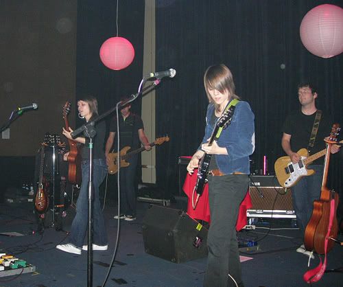
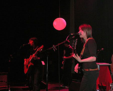
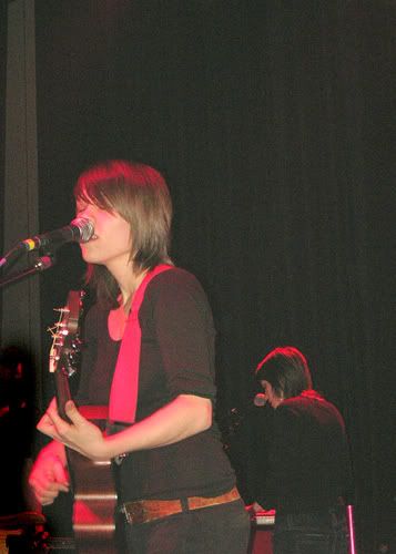
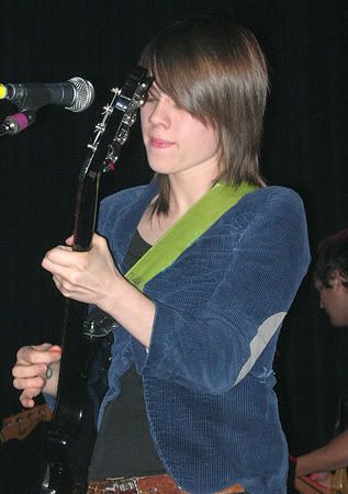
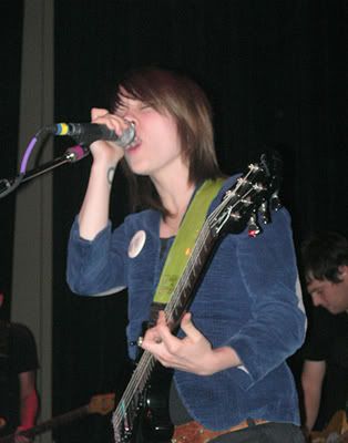
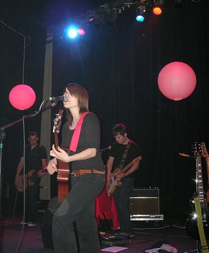
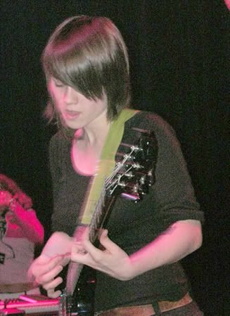
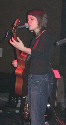
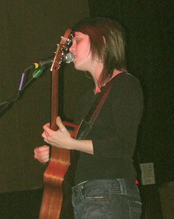
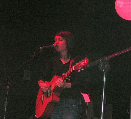
Well, I saw Tegan and Sara this week. Super cute Canadian lesbian twins. They were awesome. And I knew all the songs they played. And it was awesomeeeee.
They're great on stage because they talk in between songs - and share cute little stories. Sara made all of us clap over our heads becuase she hates it when there are some people reluctant to clap. Oh, they're just great.
Here's some pictures. I photoshopped and cropped them so they could fit in this damn blogger.

Image hosted by Photobucket.com

Image hosted by Photobucket.com

Image hosted by Photobucket.com

Sara:
Image hosted by Photobucket.com Image hosted by Photobucket.com
Image hosted by Photobucket.com

Image hosted by Photobucket.com

Tegan:
Image hosted by Photobucket.com Image hosted by Photobucket.com

Image hosted by Photobucket.com
[Tegan's the better looking one....even though they're twins.]

beautiful

I have an unhealthy obsession with Chris Ware. I really need to own a copy of Jimmy Corrigan. randomhouse. wikipedia.

OMG!! Wikipedia just told me that he currently likes in Oak Park!!1!1 Holy shit.


spoon spoon spoon

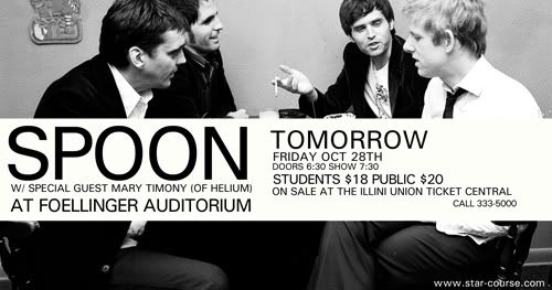
So Alan is probably gonna hate me, but I submitted an ad for our newest assignment for Starcourse. I don't even think it's that good, so it might not even get picked. Who knows! Dave might not pick mine! And anyways, Alan and Tiffany are supposted to kill me at some point, so it's all good. I just feel like I have to make up for my messed up Spoon bus poster. I saw it this week while on the bus and it dissapointed me. I'm still kicking myself in the face for not flattening it and stuff. It's like DUH, kinko's isnt going to have the font Univers. Because that's a fancy graphic designy mac font.
But anyways, here it is. I could have done a better job with it, though. Oh well, the deadline was today.


oh yeah, this is for the Buzz the day before the show, hence the 'tomorrow.'

logomania

Oh no. I haven't written for a week. That's no good.
Well, all this logo stuff is making me go crazy. I notice logos everywhere and critique them.
And the FedEx logo is still so amazing to me. I don't know if it's because of the font choice that makes the arrow show up or if the designer consciously chose to have the arrow there. Geez, now it makes me wonder how someone comes up with that.

But I think the arrow would be more clear if the d and the E were the same color.

Here's what I'm probably going to pick as my final logo:
Image hosted by Photobucket.com

Hmmm, but now looking at it, the "THE" is annoying me. And the font is a bit too big. But we can change that later so it's perfect for Thursday. yay!

polska

So I started becoming nostalgic for Poland and googled my hometown, Lomza.
I found a website about some American guy living in Lomza - like some sort of experiment.
He wrote: "In Poland, people never used to go out to restaurants or bars, didn’t use to have anything in the shops worth buying, so they lived on their own and stayed at home, entertaining their friends, cooking elaborate meals, drinking vodka, making their own clothes." And it's so true.

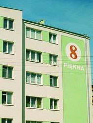
But it's so amazing reading about Lomza from the perspective of someone like him. He describes the architecture as "divided into two categories: communist apartment blocks and crumbling pre-war buildings."

But look at it, I think this building is beautiful. That's how all the buildings back in my hometown are. Colorful and symmetrical. And this particular street IS beautiful because it translates to "Beautiful." I'd love to live on 8 Beautiful Street.

Hahahahaha!


Look how happy Poland is!!
I found this ridiculous website: http://www.kidscolorpages.com/countries.htm
And it has the most stereotypical pictures for each country. Haha it made me laugh, especially China and Russia's. Greenland and Iceland are also good. What a great way to teach children about other countries. Today, we salute you, kidscolorpages.com.

'08s


Representing the best fratority around.
This, along side with Oh My Cod, should be made into a t-shirt. Heeyy! I should submit Oh My Cod to threadless.com. People would wear that, no?